

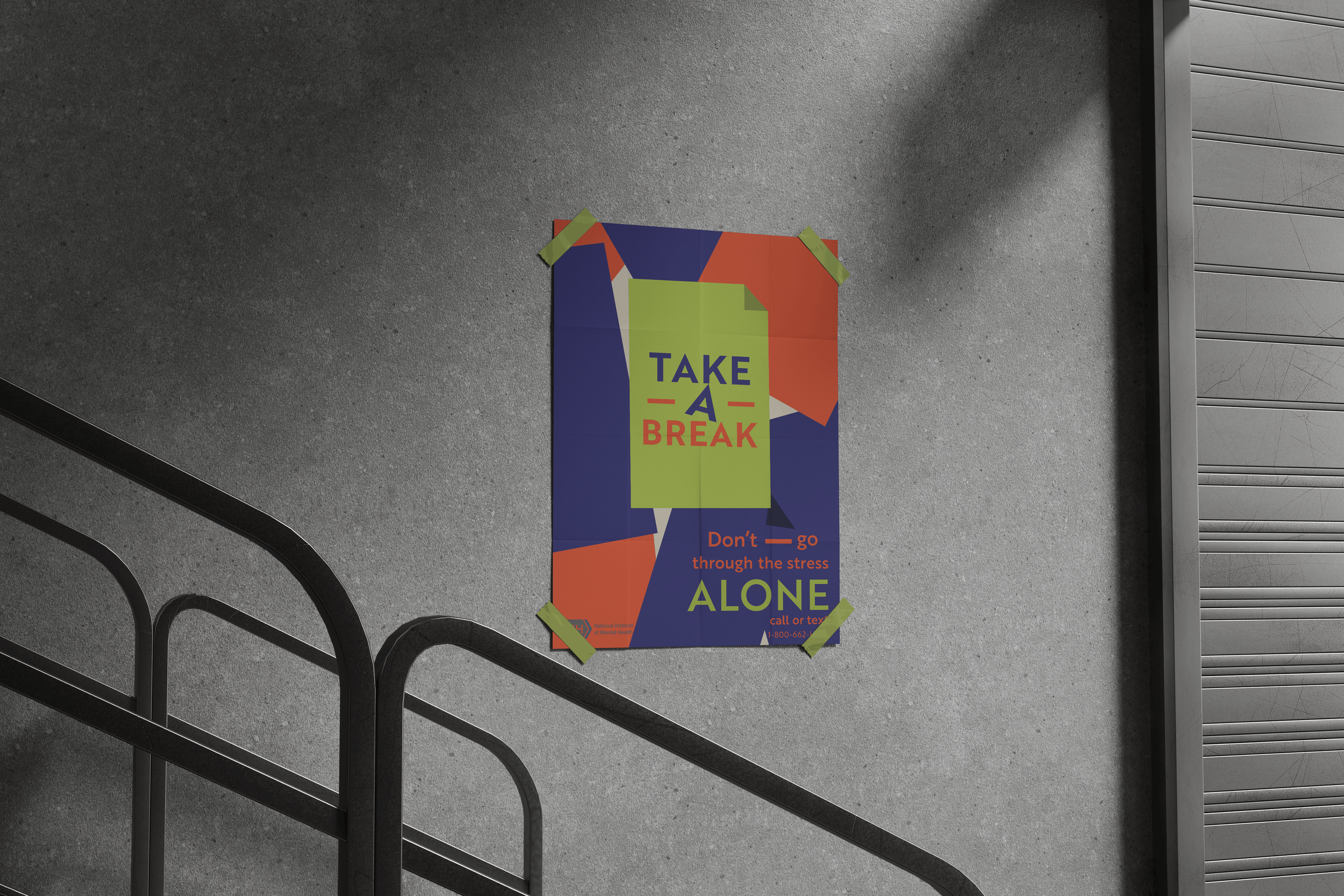
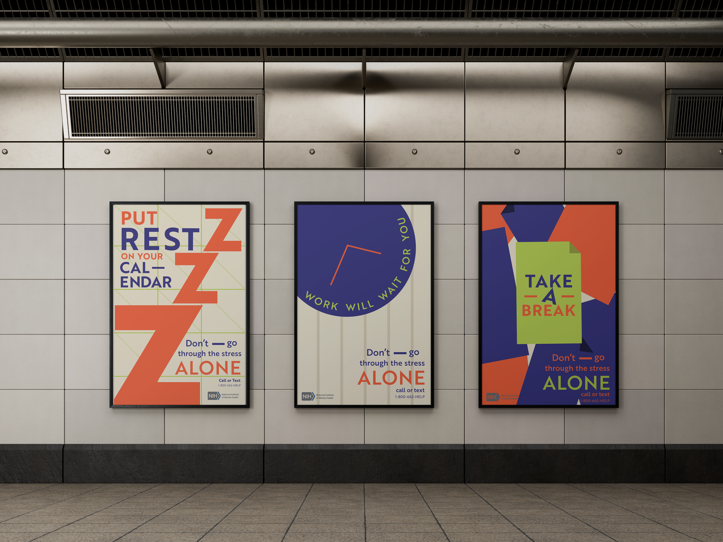
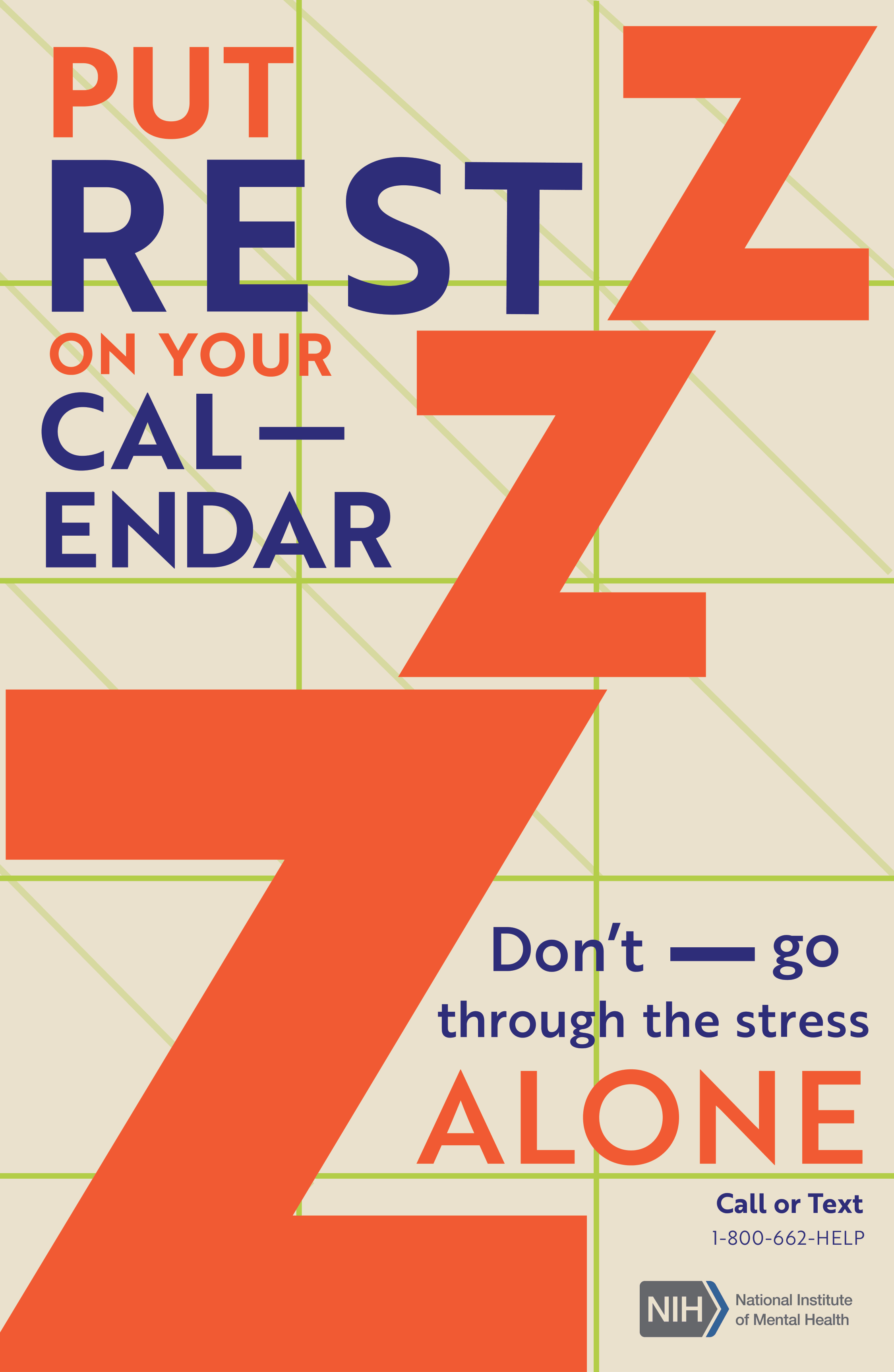
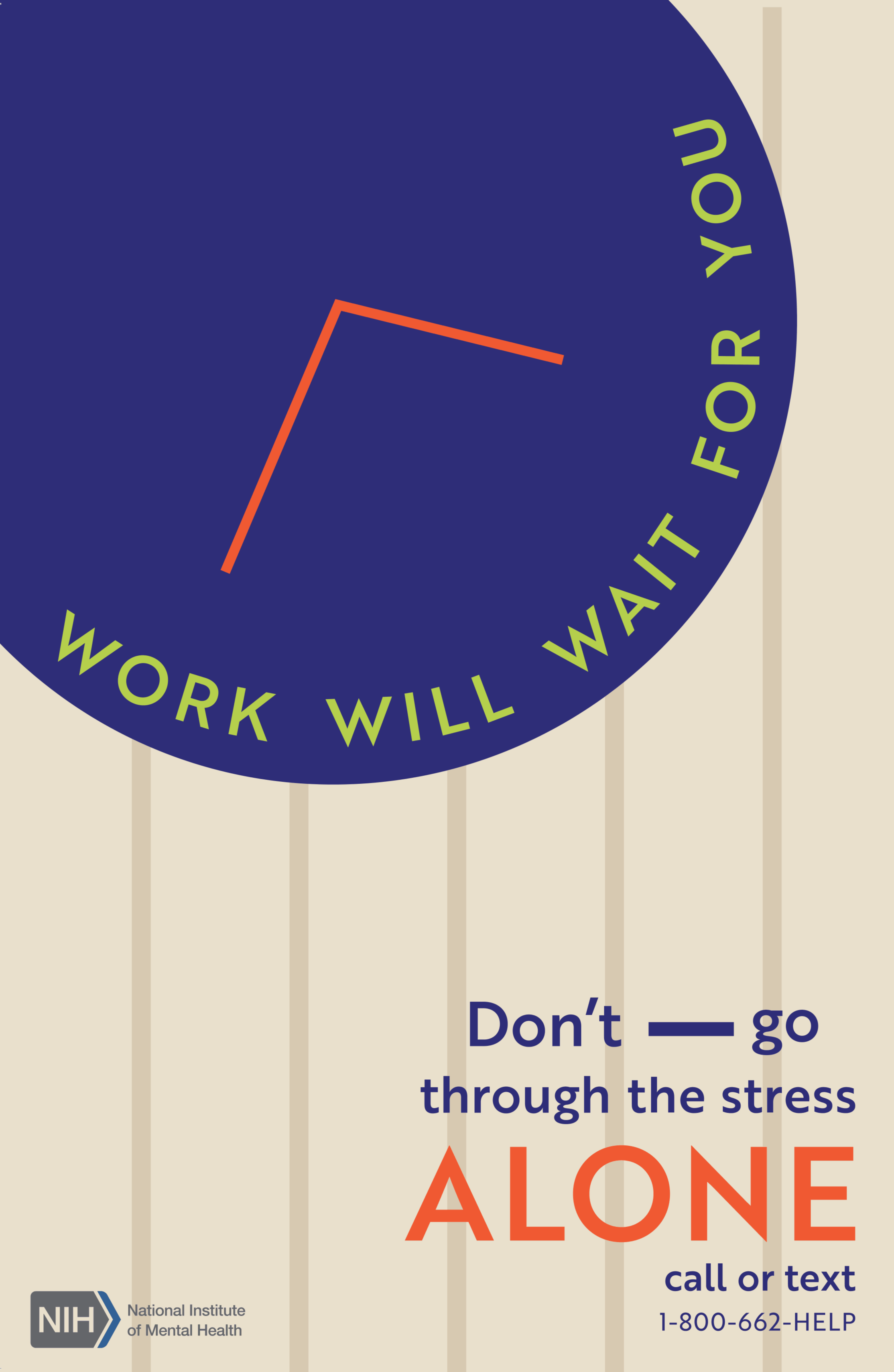
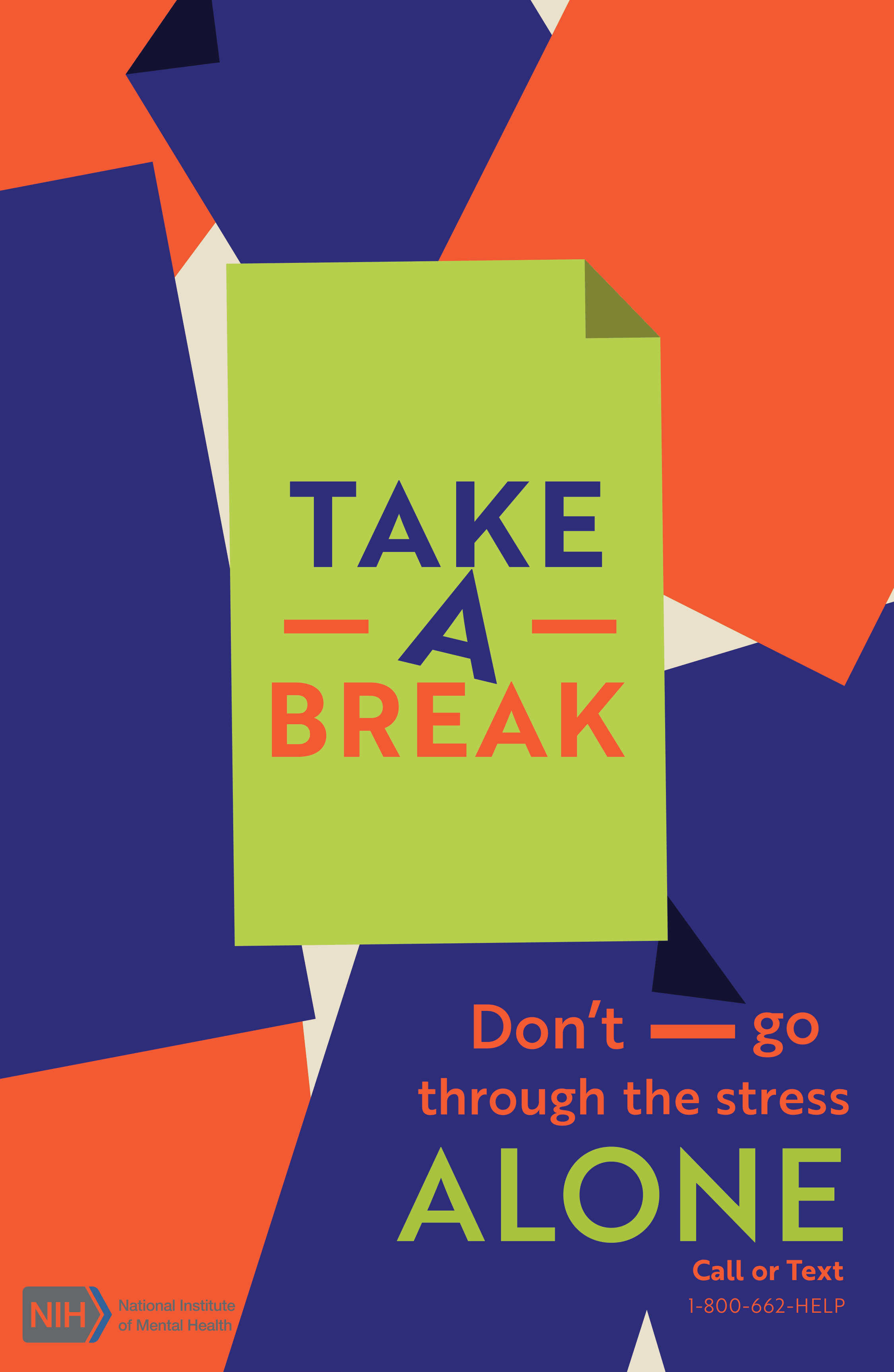
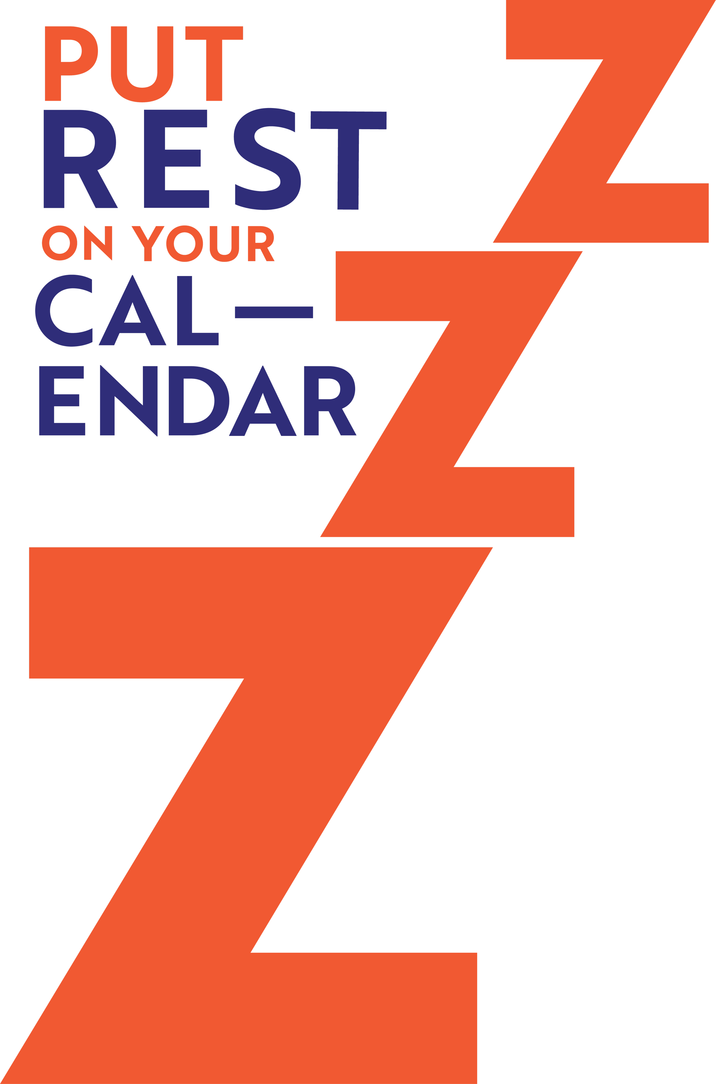
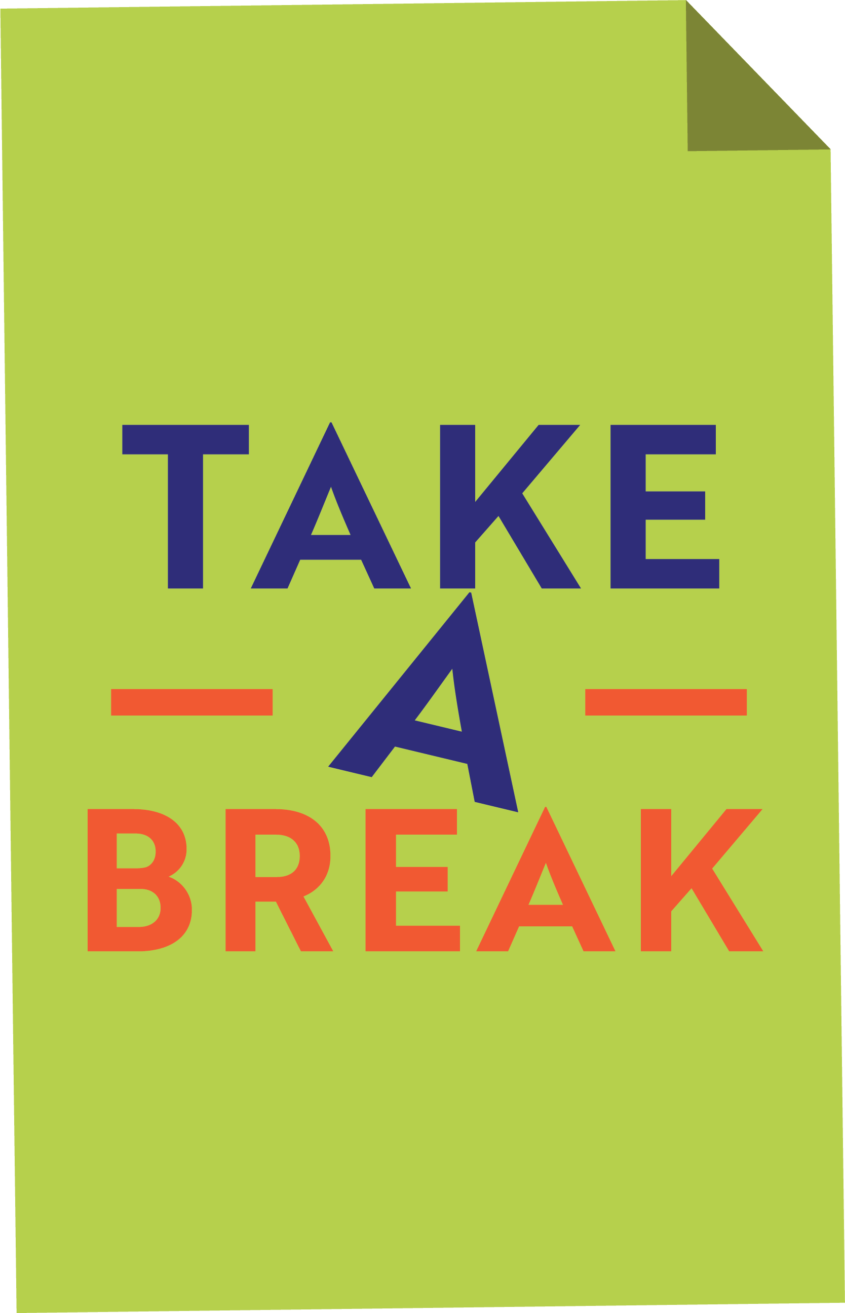
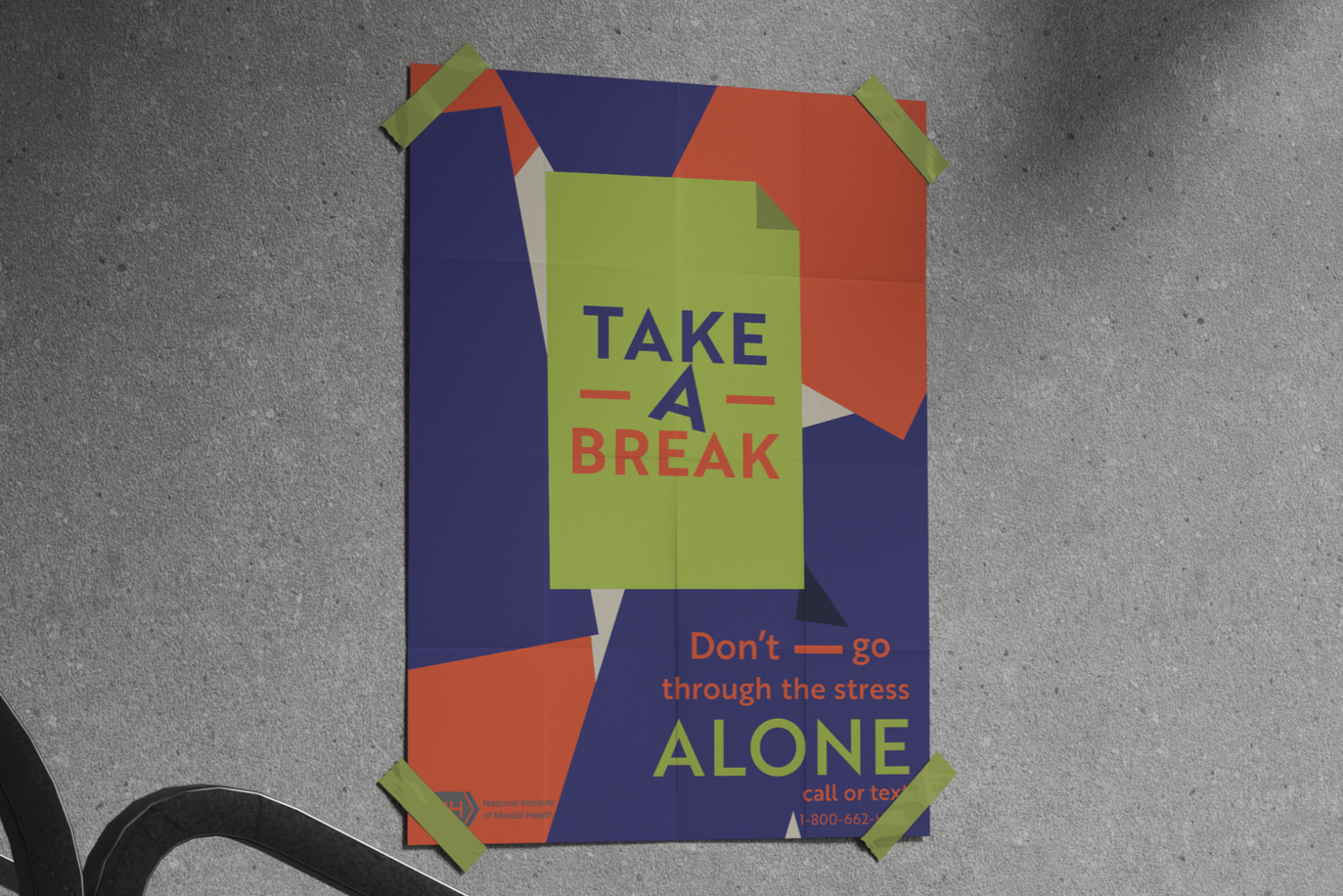
I wanted to create a more simple, Swiss-style inspired piece for this since I hadn’t really explored the minimal side of graphic design yet. It was definitely a process. This was a challenging design, to say the least, and I went through a lot of revisions to get it to look the way I wanted.
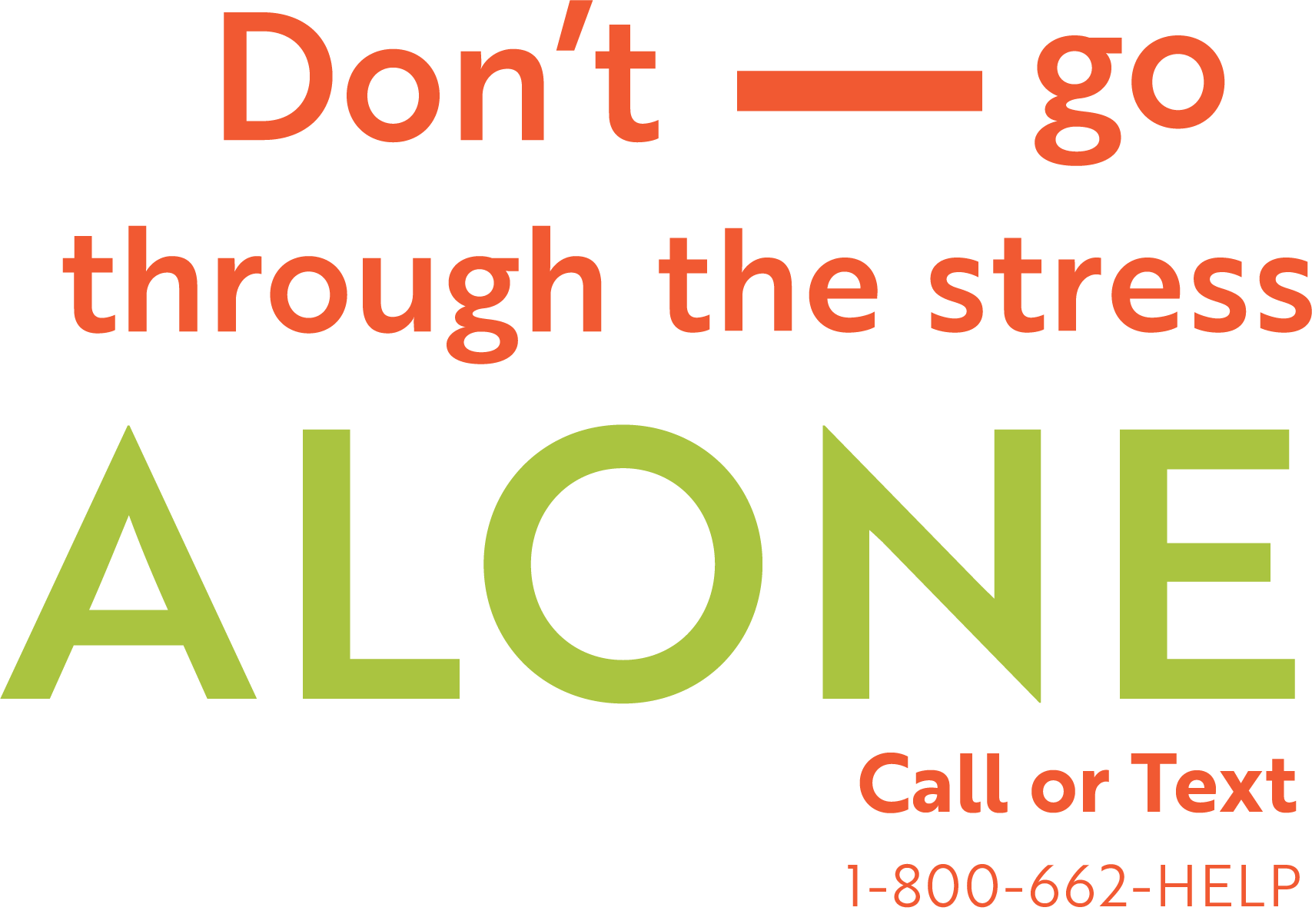
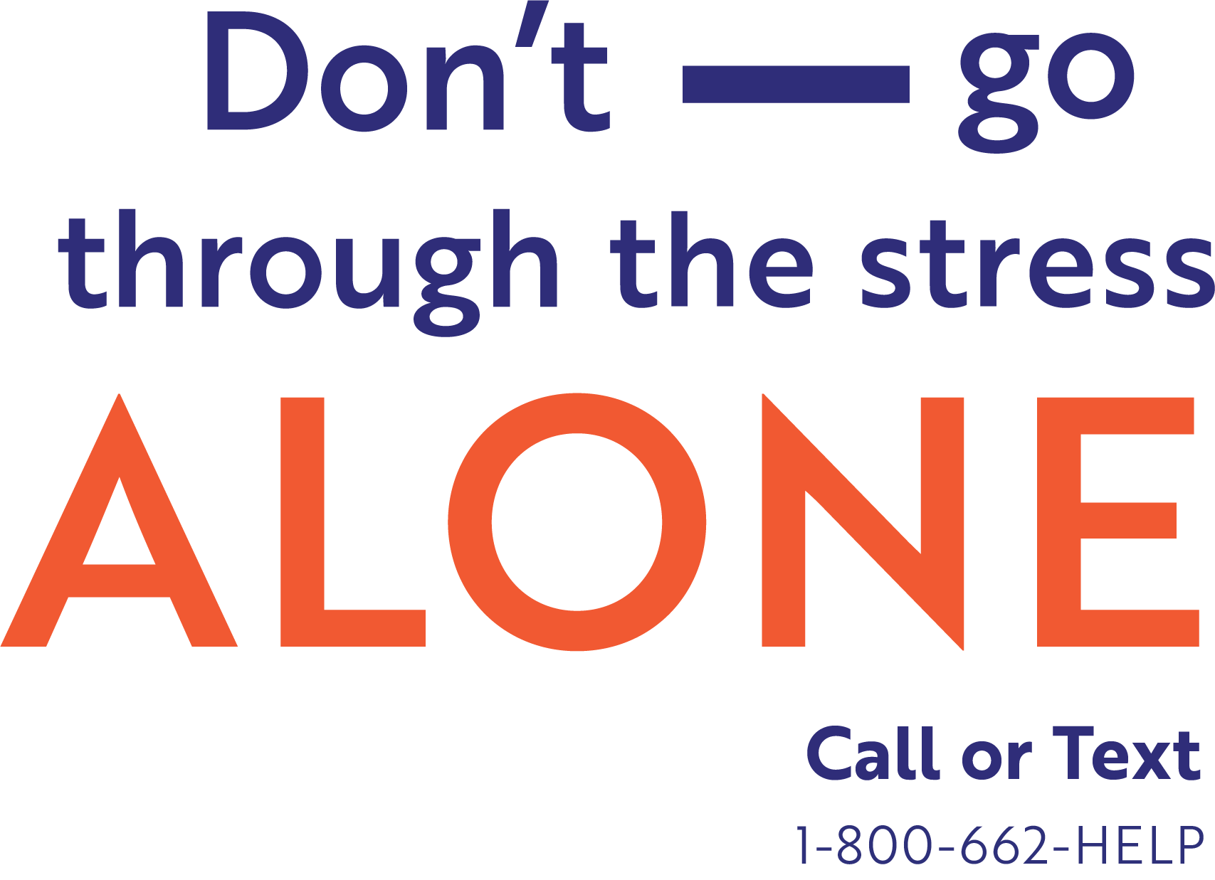
I decided on these bright colors because I saw them used often in Swiss design, but also because they contrast with the topic of the posters: work addiction.
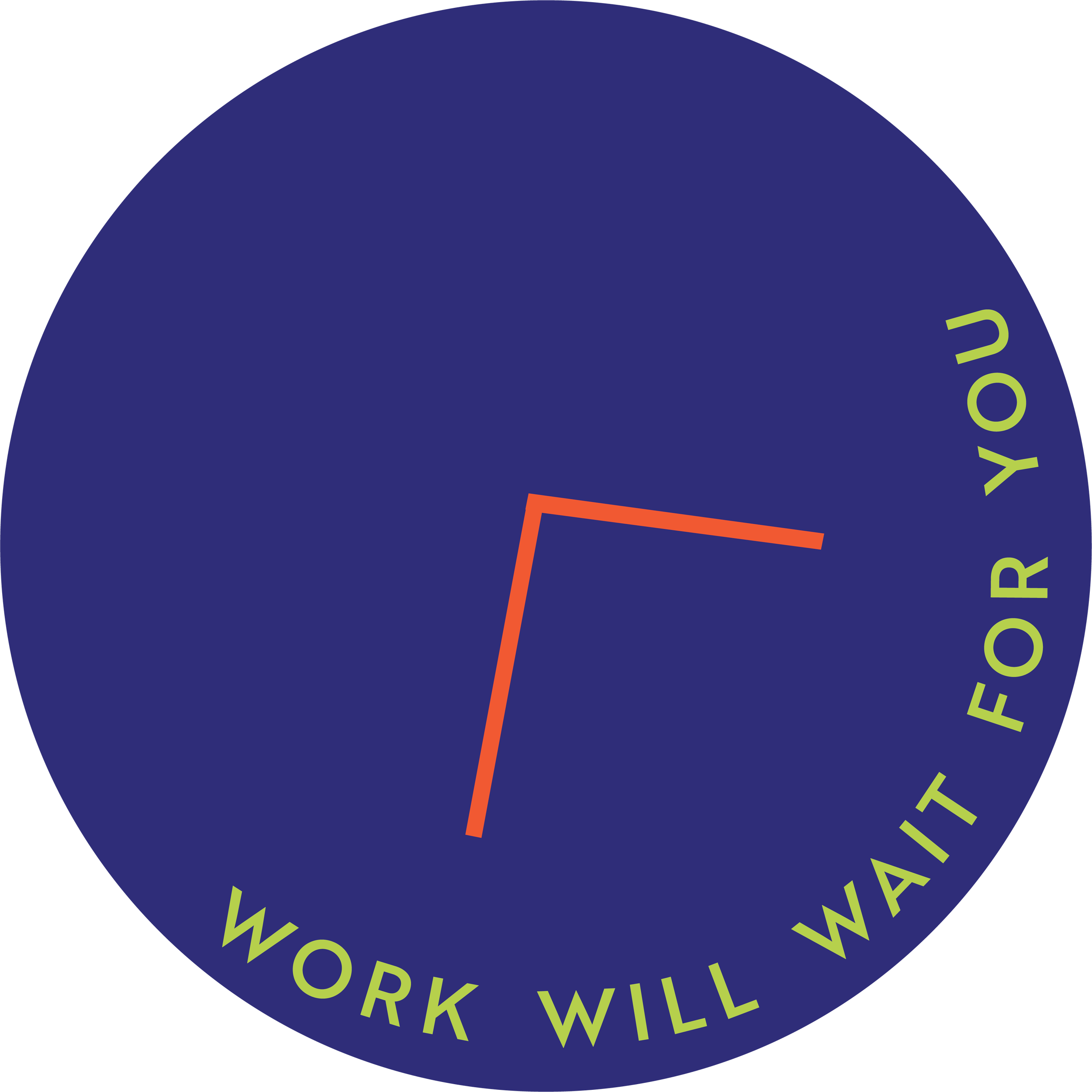
Each poster is inspired by things you would find in an office, such as a pile of papers, a clock, and a calendar. Another element of this design is the dashes scattered throughout each poster. These dashes represent “taking a break.” I chose to use them because we often use dashes in writing to break up a sentence.
Browse Works
Gig Poster
Album Cover
Social Issues

Sports Motion
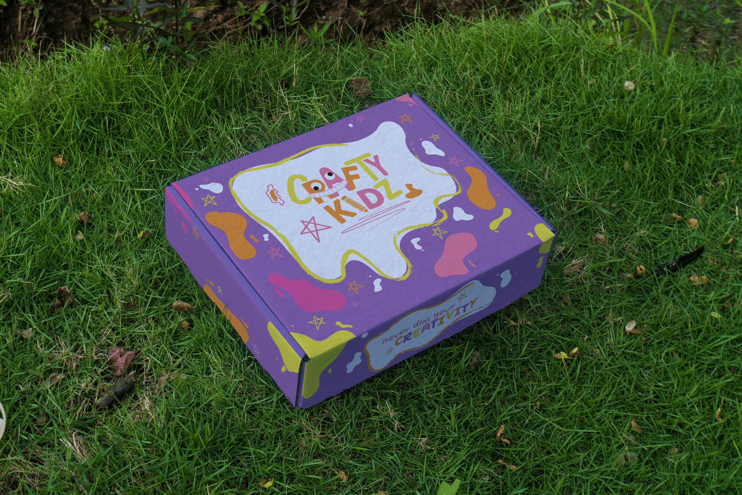
Crafty Kidz
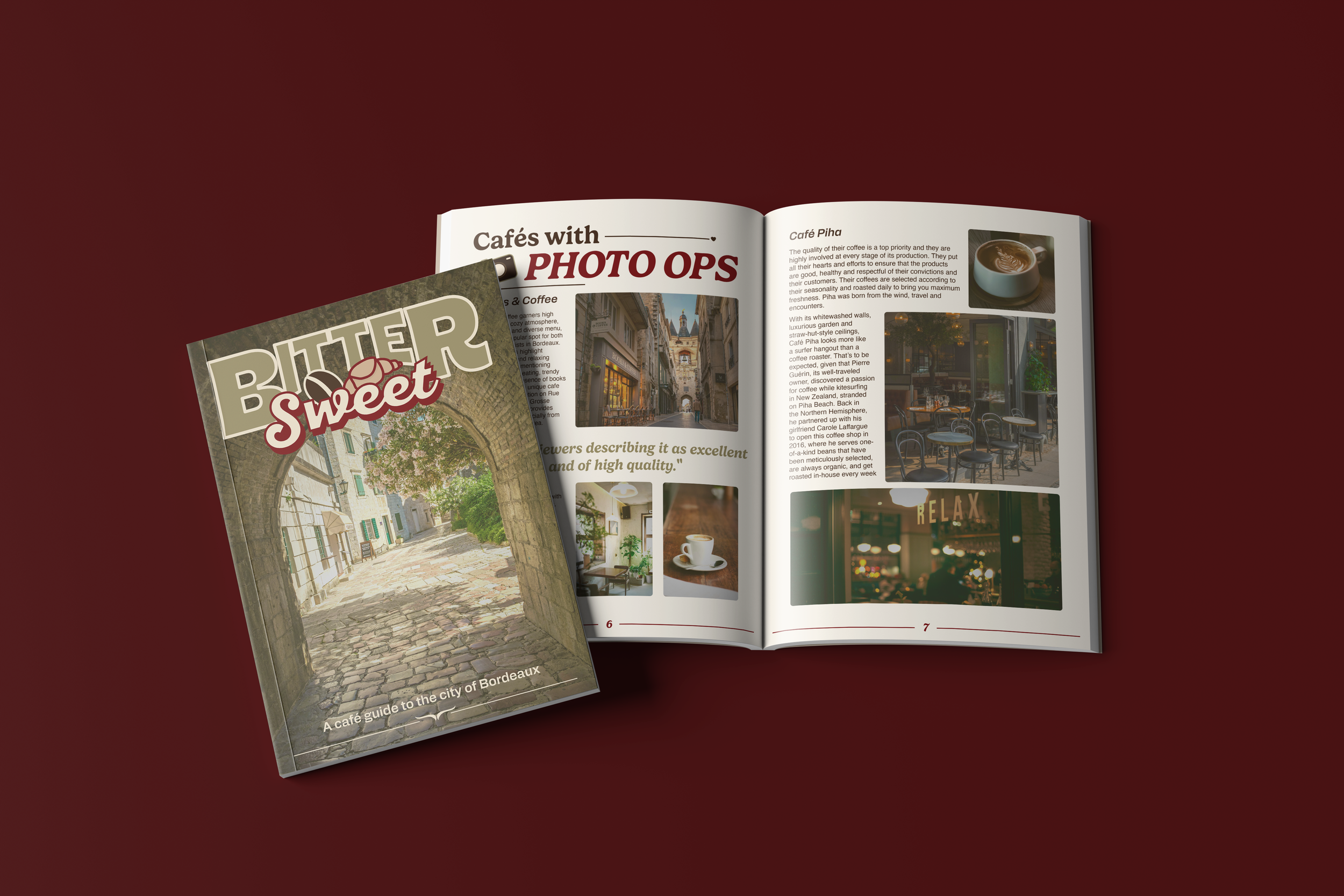
City Guide
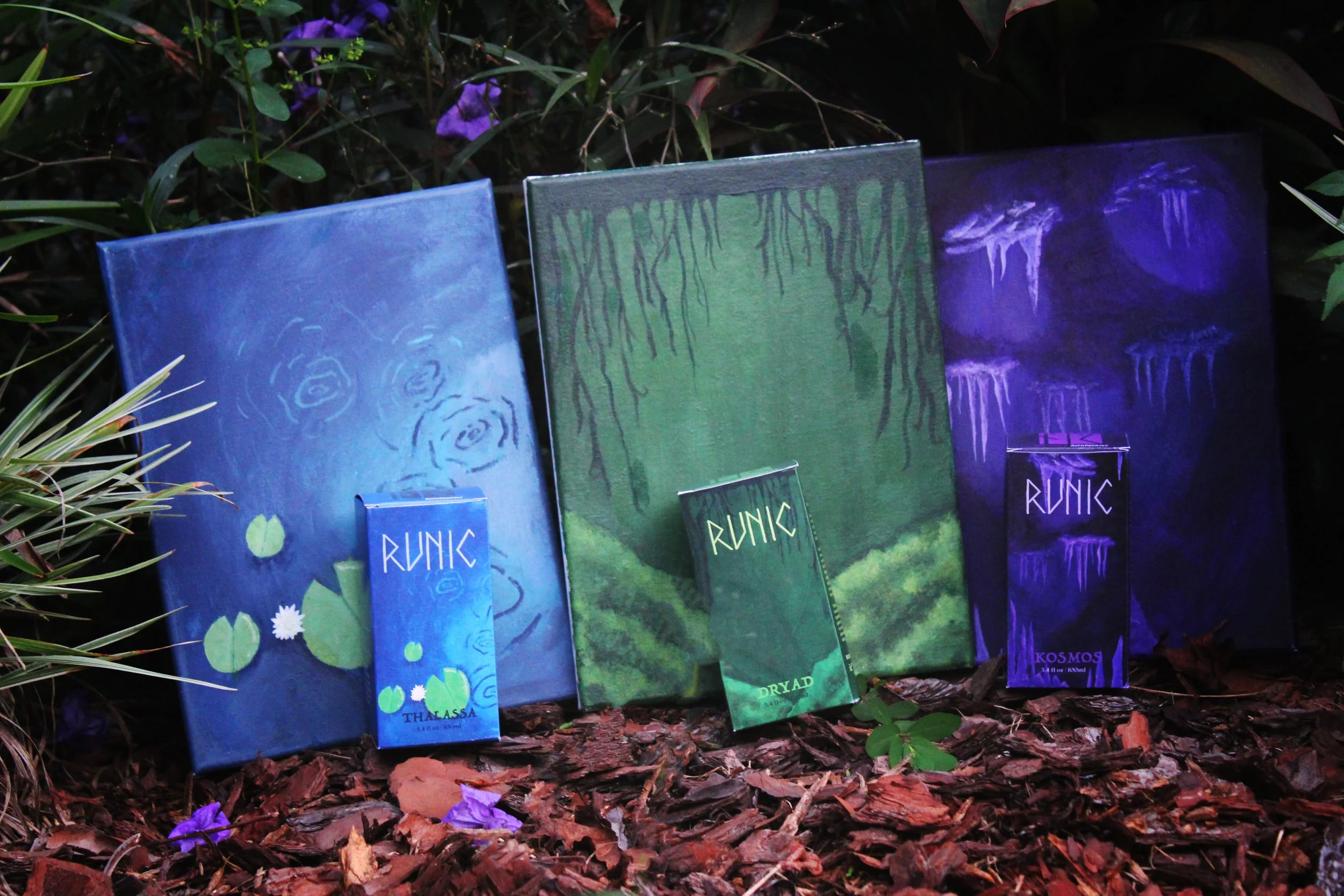
Runic
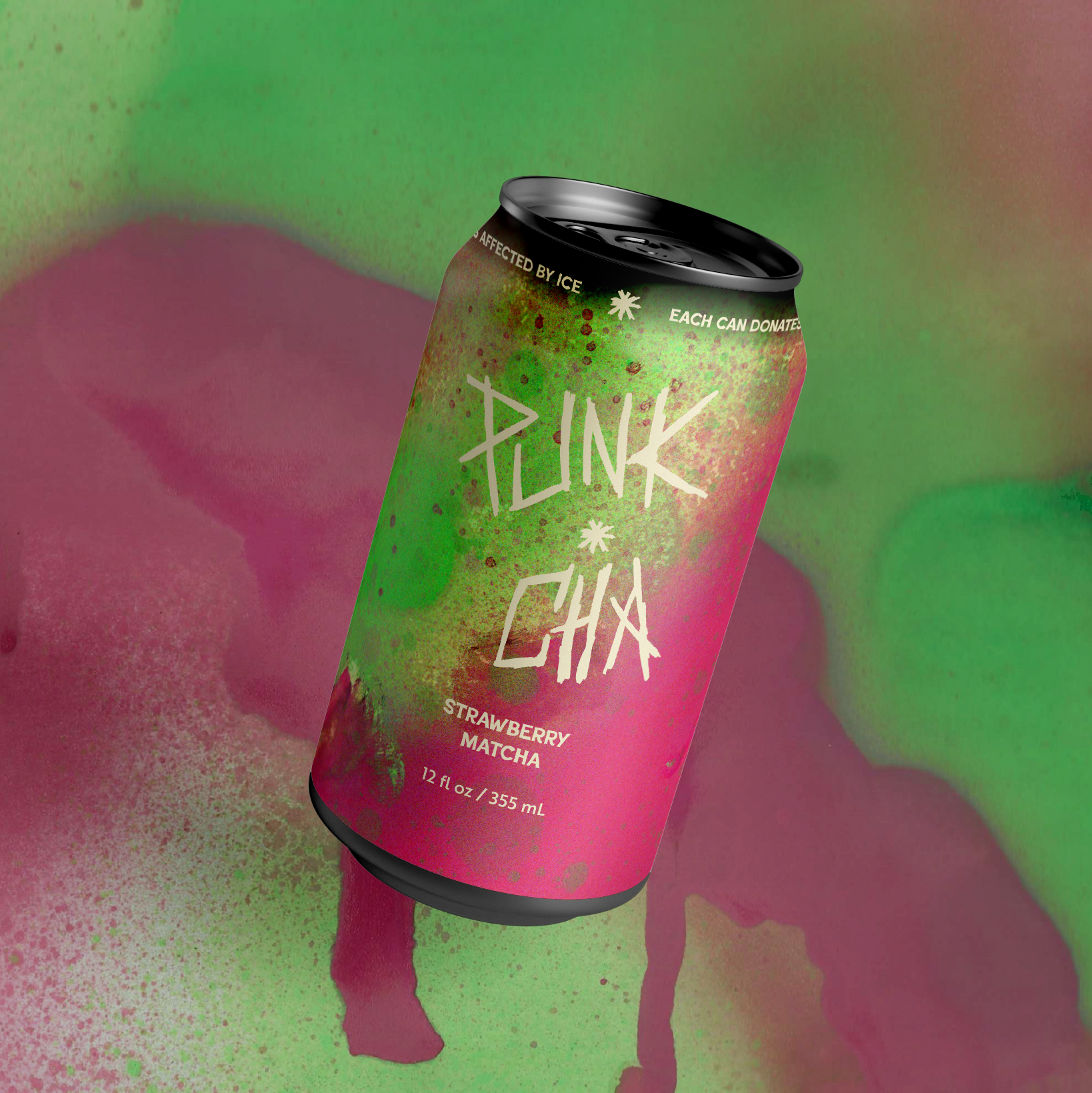
Punk-cha